
- Total $ 0.00

PANTONE’S FALL PALETTE
Gemstone shades of the season
Colored gemstones aren’t just for celebrating birthdays and anniversaries — they’re opportunities to merge color and personality to create unique, striking designs. This look at Pantone’s fall colors will allow you to playfully select gemstones to coordinate with the trendy shades of the season.
 Pantone’s Riverside
Commanding the importance of blue this fall, the new shade of Riverside takes precedence in the color collection. Cool and calming, strong and stable, this blue hue displays a subtle vibrancy and sophistication. It borders on exciting yet maintains a sense of constancy.
Blue Sapphire
Sapphires have long been prized for their intense, velvety color, ranging from the deepest midnight to brilliant cornflower blue. The calming influence of blue has also made it an enduring symbol of loyalty and trust — one reason that women around the world choose Sapphire for their engagement rings.
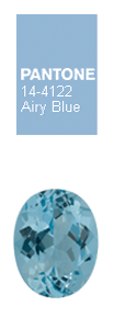 Pantone’s Airy Blue
As its name suggests, Airy Blue has a lofty nature that evokes feelings of lightness and freedom. This light blue nods to Serenity, one of Pantone’s 2016 colors of the year. Pair this tranquil color with dark green, taupe, or rose for a fresh approach.
Aquamarine
As most people choose blue as a favorite color,Aquamarine’s powdery hue is a perfect gem for blue lovers. The name means “ocean water,” and tales of Aquamarine date back to ancient seafaring days. Aquamarine is said to promise love, health, and youthful energy to those who wear it.
 Pantone’s Sharkskin
There’s an edge to Sharkskin, yet it manages to be neutral as well. This gray is far from being dull and can be paired with almost any fall color, bright or muted. Sharkskin is a fabulous complement to the rest of the palette and remains both contemporary and practical.
Tahitian Pearls
Also known as black pearls, Tahitian Pearls offer a sophisticated look with natural appeal. For women of all ages, few gems offer greater drama than strands of Tahitian Cultured Pearls, dynamic for either daytime or evening wear. These pearls create superbly fashionable jewelry that, with proper care, will last for generations.
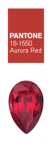 Pantone’s Aurora Red
In contrast to the stable spectrum of the fall 2016 palette, Aurora Red adds a welcome punch. It is a bold Red that is warm, sensual, and immediately pleasing to the eye. Exciting and dynamic, Aurora Red breeds unmistakable confidence as it gets the metaphorical blood of the palette pumping.
Ruby
Fiery and romantic, showing brilliant depth and intensity, the red hue of Ruby is certain to draw attention. Ruby sends a message of drop-dead glamor and femininity, especially in settings that focus attention on its voluptuous color. If you’re looking for the color of life itself, look no further than red.
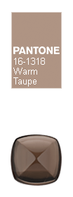 Pantone’s Warm Taupe
Warm Taupe is a hearty, pleasing, and approachable neutral that pairs well with each of the top 10 shades of the fall season. This dusty earth tone suggests reassurance and stability. It is trusted, organic, grounded, and timeless.
Smoky Quartz
Smoky Quartz ranges from pale tan to deep brown to nearly black in color. The stone may be opaque, though it is more commonly translucent. Smoky Quartz is said to be grounding and able to remove negative energy. Easily had in large sizes, this dark and brooding quartz is a good choice for a customer looking to make a statement.
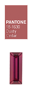 Pantone’s Dusty Cedar
Dusty Cedar gives a nod to Rose Quartz, one of Pantone’s 2016 Colors of the Year. This shade is a fall and winter version of the pinks we’re used to seeing in spring. Dusty Cedar is a gentle, rose-toned pink shade with some complexity as it exudes warmth and welcome.
Rhodolite Garnet
Rhodolite Garnet can cheer even the bleakest day. It immediately lifts the spirits as it creates lively and exuberant excitement in all who wear it. A luxurious color, Rhodolite Garnet looks more expensive than it actually is, making it an ideal accessory for the understated styles of winter and fall.
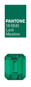
Pantone’s Lush Meadow
Lush Meadow brings to mind fresh botanicals and foliage. This deep green is rich and elegant, vibrant and sophisticated. The shade displays a brightness and depth of color that elevates it from more natural greens. Lush Meadow elevates the overall elegance woven through this year’s fall 2016 color collection.
Emerald
Lush. Exotic. Untamed. This is no polite, garden-variety green: Emerald pulses with life and vitality. Emerald is a perfect autumn complement and the perfect hue to dispel winter blues.
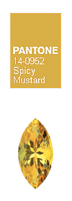 Pantone’s Spicy Mustard
Bouncing elegantly off other colors in the palette, Spicy Mustard is an exotic addition. A spicier, zestier yellow than previous seasons, this color adds another splash of uplifting vibrancy. Spicy Mustard is an unexpected and unusual addition that is sure to make any design pop.
Citrine
The gold of Citrine draws us in and brightens our moods. Its radiant color is associated with joyfulness, youth, and vitality. Wearable, affordable, and fashionable, Citrine is a shimmering yellow gemstone that draws the eye and captivates the viewer.
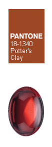 Pantone’s Potter’s Clay
Potter’s Clay has an added degree of sophistication and layering. Elements of russet orange in its undertones gives a grounded feeling that’s anything but flat. A shade with real substance and a strong foundation, this neutral earth tone is expected for fall and winter.
Mozambique Garnet
Mozambique Garnet, glowing deep red with hints of orange and brown, reminds us of an autumn harvest or Indian summer. These styles reflect today’s culturally rich society, giving Mozambique Garnet special appeal to those who seek a sophisticated yet organic look. This distinct gem offers the warm, wine-red color that garnets are best known for.
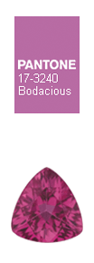 Pantone’s Bodacious
Bodacious lends itself to vibrant color combinations. Unexpected in fall, this versatile color can be used with pinks and reds. It's bright, rich purple with hints of a more sophisticated pink turns fashion accents into fashion statements.
Pink Tourmaline
This enthralling, positive stone not only enhances the energy of its wearer but also attracts the attention and energy of others. It’s bold, confident, beautifully sensitive, and self-assured. Pink Tourmaline expresses an exhilarating timeless feminine charm with a decidedly modern edge.
“The desire for tranquility, strength, and optimism have inspired a Fall 2016 color palette that is led by the Blue family.
Along with anchoring earth tones, exuberant pops of vibrant colors also appear throughout the collections. Transcending gender, these unexpectedly vivacious colors in our Fall 2016 palette act as playful but structured departures from your more typical fall shades.
Blue skies represent constancy as they are always above us. Grays give a feeling of stability, Red tones invite confidence and warmth, while the hot Pinkish Purples and Spicy Mustard Yellows suggest a touch of the exotic.”
–Leatrice Eiseman
Executive Director of the Pantone Color Institute™
Which of these colors do you absolutely love? What other colors do you hope to see around this fall? Are there any other gemstones that your customers are crazy for this season? Let us know in comments below!